We honestly feel blessed becoming involved in new business ventures at embryonic stages and relish to be in the position of being able to bring a company to life through conceptual graphic design.
This particular client has over 20 years proven experience in the sale and acquisition of Care Homes in the UK and having been hugely successful in top firms and built an enviable reputation wanted to enjoy the fruits of labour through an enterprise of their own creation.
The company name had been chosen but no logo at the time we joined the discussions. We have a short questionnaire on our site which helps to compile a basic brief which we then can be developed with the client. This can be found on our contact page.
From this exercise the client wanted the brand to communicate the following keywords; transfer agency, property, traditional, established, trustworthy, professional...but the one word which the client wanted to prioritise was 'confidentiality' - a key attribute to the business process in their industry.
Proposed Concepts
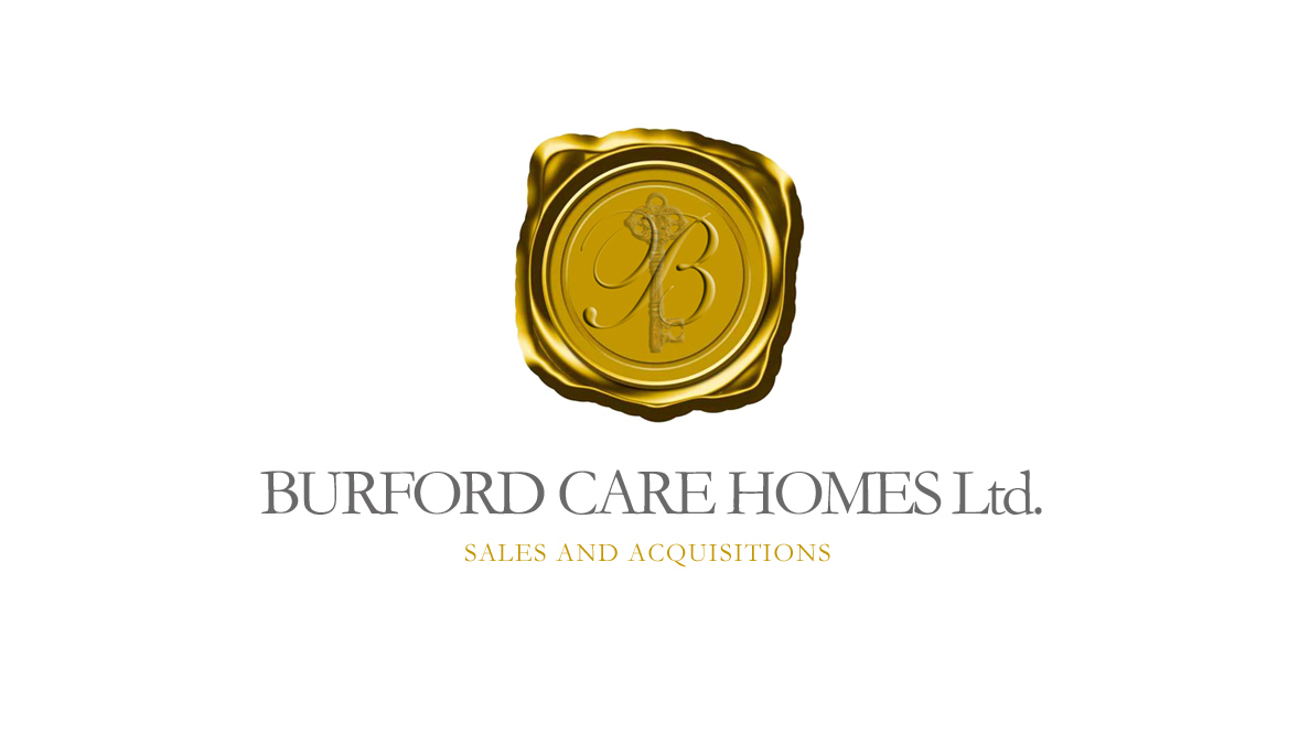
This particular conceptual challenge was to marry the keywords of 'property' and 'confidentiality'. Working on a 'traditional' approach (one of the keywords) we were drawn to the concept of a wax seal. This, to us, conveyed confidentiality and also gave the logo credibility as it was only dignitary and royalty who would have their own seal crest. This gave the concept standing and also allowed us to incorporate a crest into the seal or a logo within a logo in essence. The company name gave us our initial letter 'B' and we decided on an ornate key to communicate 'property'.
At this point of the creative process colour options had not been discussed so this concept would ultimately provide us with the colour palette with which to move forward.
Most visions of a wax seal are blood red and we did present one such option but to give the brand a feeling of excellence we also presented a gold version as below.
This then gave us our colour palette of gold and black/grey. We then drew a simplified house icon to represent the property constituent of the brand. To further the concept of a service of authority and, possibly directed by the gold, we duplicated the house icon and arranged them in an arc to form a crown.


The client was also drawn to the strength of the structure now created. As often is the case with these projects the client then recognised an image within the brand that we had not discussed before but had evolved throughout the brand development. The client saw this final icon to represent a board room table representing the negotiations of their work.
The Final Logo
Final development was primarily in the choice of fonts, the use of the grey moved to the strapline, black brought in for the company name, a plinth-like line incorporated and the brand was born.

“Although we have worked in our specific industry for many years, the task of taking our own fledgling company into an established marketplace was an intimidating one. Jordan (Creative Director, Logo Laureate) was able to create a brand for us which reflected experience and maturity. The logo Jordan created summed up our business perfectly, and the process for our part was entirely painless. We were impressed with Jordan’s professional, enthusiastic approach and his understanding of our requirements was even greater than our own. We cannot recommend Jordan highly enough.”
No comments:
Post a Comment